Spec Project: New Balance “Move My Way” Campaign
Designer: Brooke Barrs
This project is purely on a spec basis and was not a collaboration with the New Balance brand.
The idea behind this project was borne out of an inherent interest in the fashion industry, especially in brands that overlap heavily with the fitness industry. Surrounding the ideas and ethos of self-expression, wellness, and community, we wanted to design a campaign that would not only promote a line of aesthetic products, but invite both existing and potential audiences into participation as part of the New Balance brand. Part of the problem to solve here was the growing expectation from consumers that brands pay attention to the state of current culture. Coming through multiple years of divisive and isolating world events, we wanted to suggest a campaign that New Balance could use to invite their audience into something shared and collective.
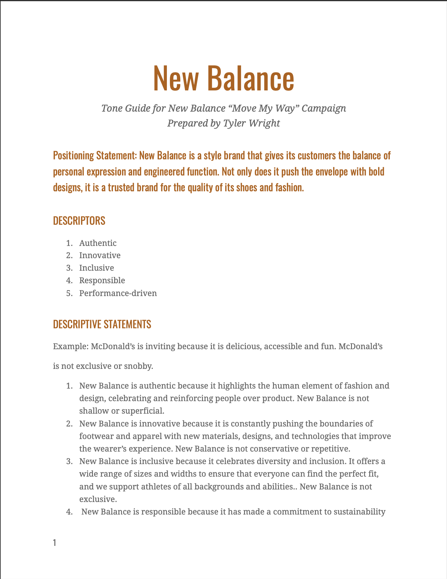
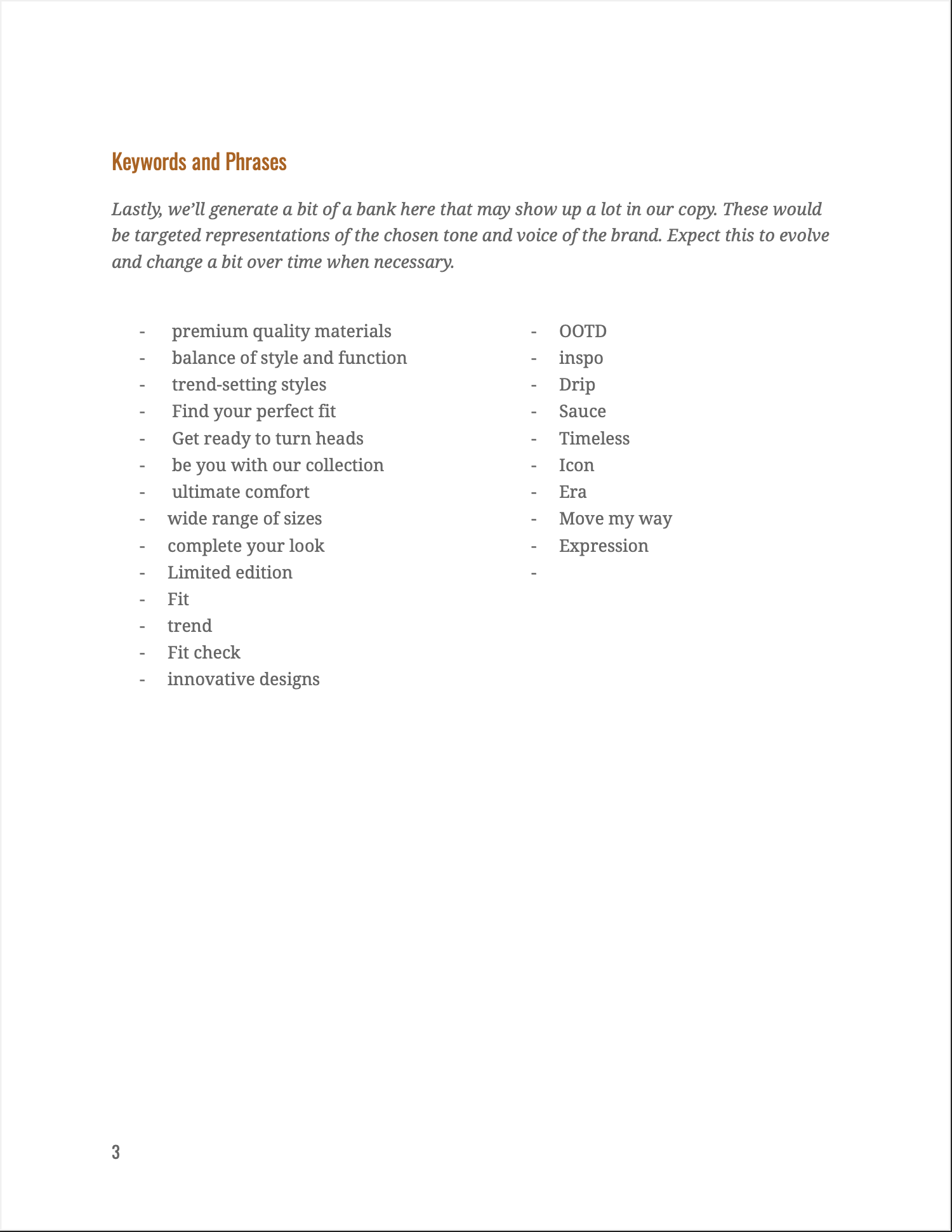
This included developing a new brand voice specific to this project, but pulling from what we had already researched about the existing voice of New Balance.
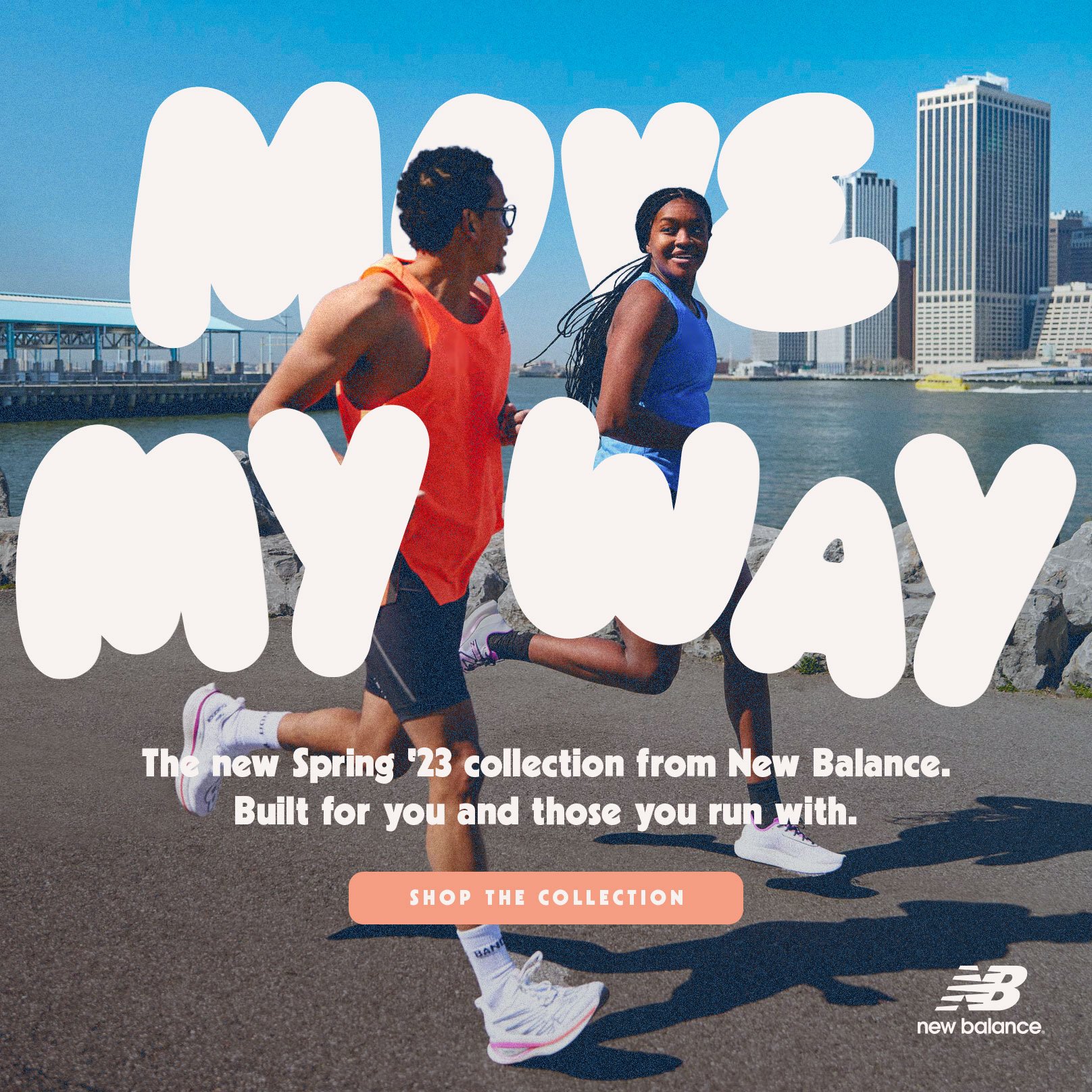
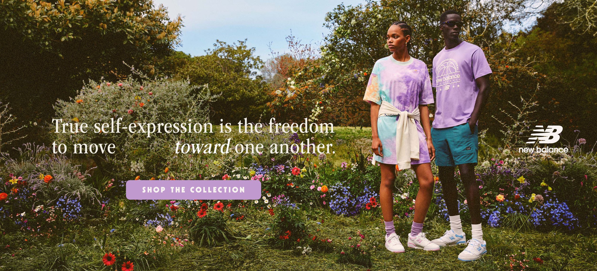
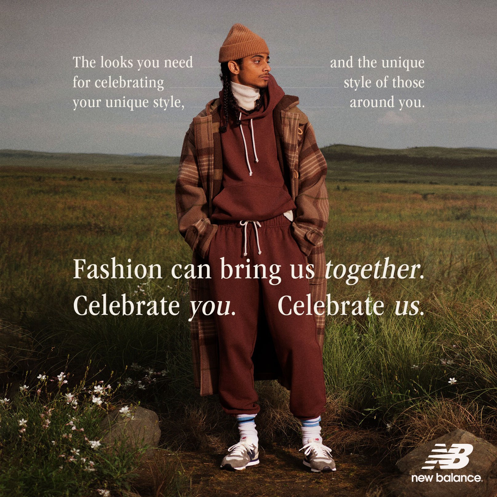
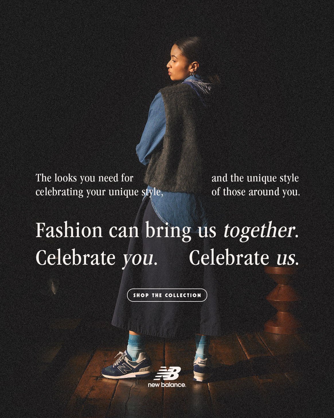
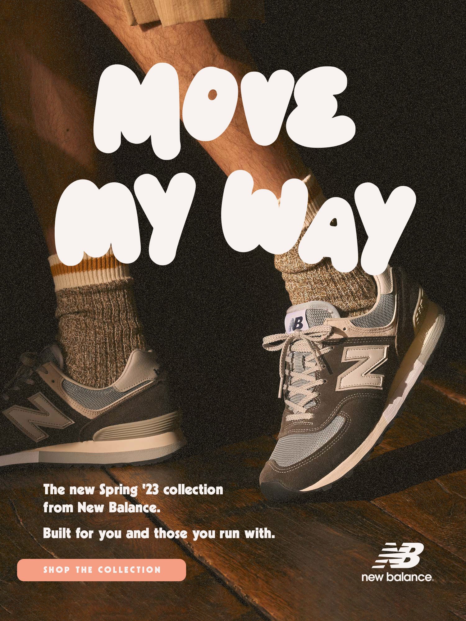
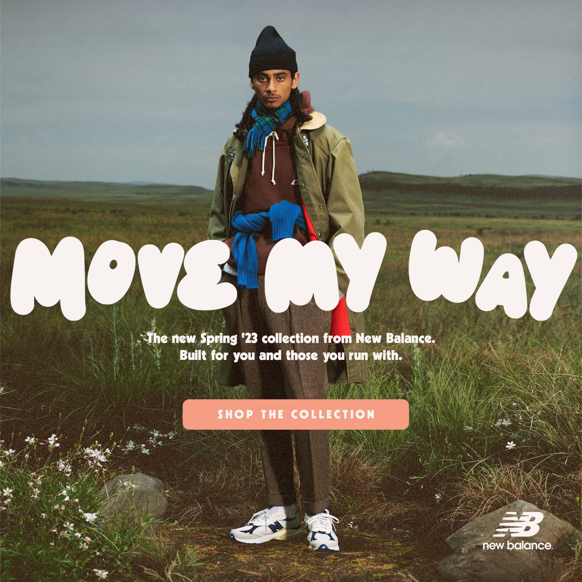
The phrase “Move My Way” is meant with a double-meaning, both using “my way” as an indicator of personal expression as well as the whole phrase as an invitation to “move toward me.” This invitation would suggest to the audience that fashion has the opportunity to be a legitimate intersecting point for people to not only express their individuality, but to join together in that expression and find connection with one another via the brand and its products. The promotion is an inherent endorsement of these ideas and feelings by the brand, which we feel like New Balance already fits and supports from it’s existing work.
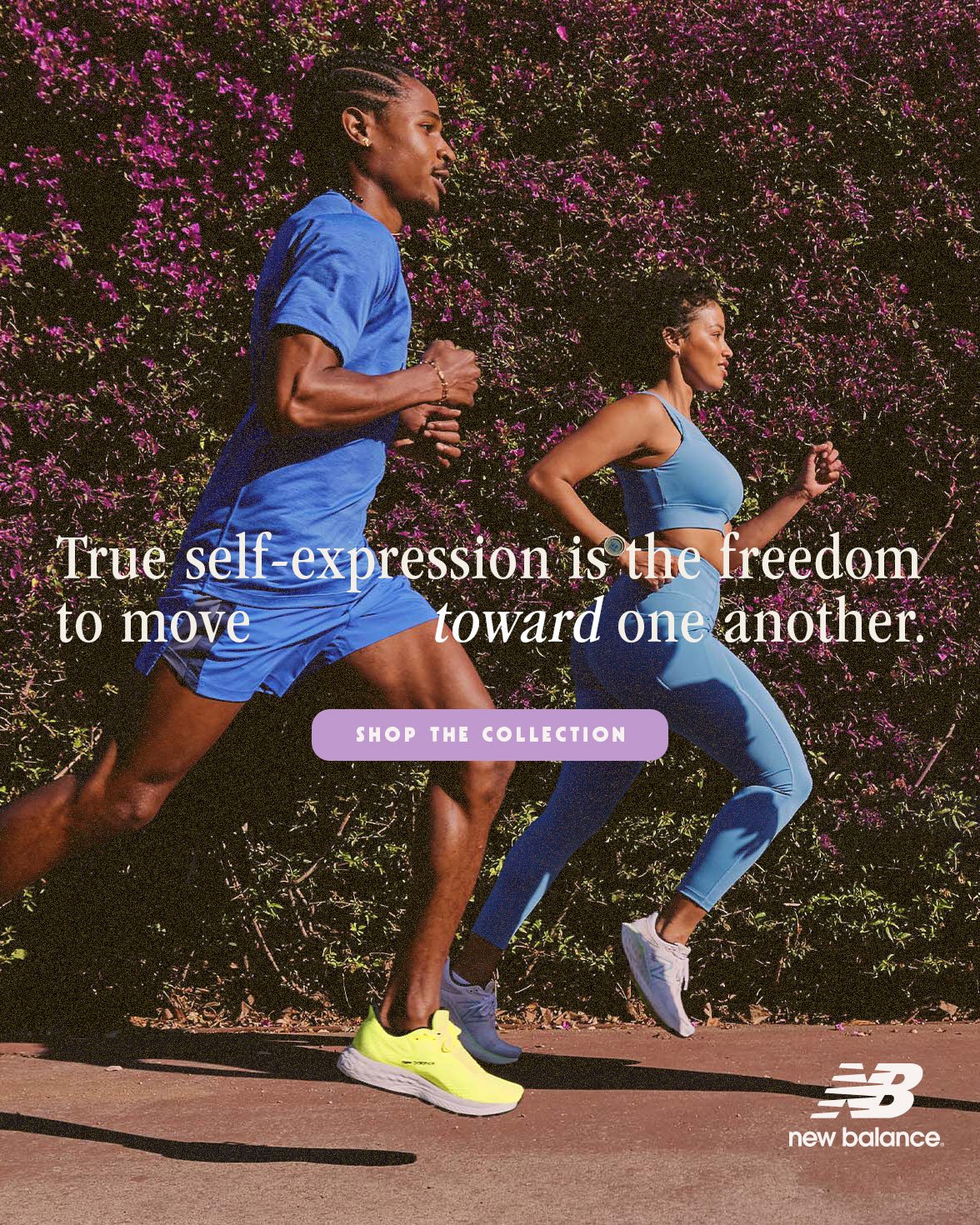
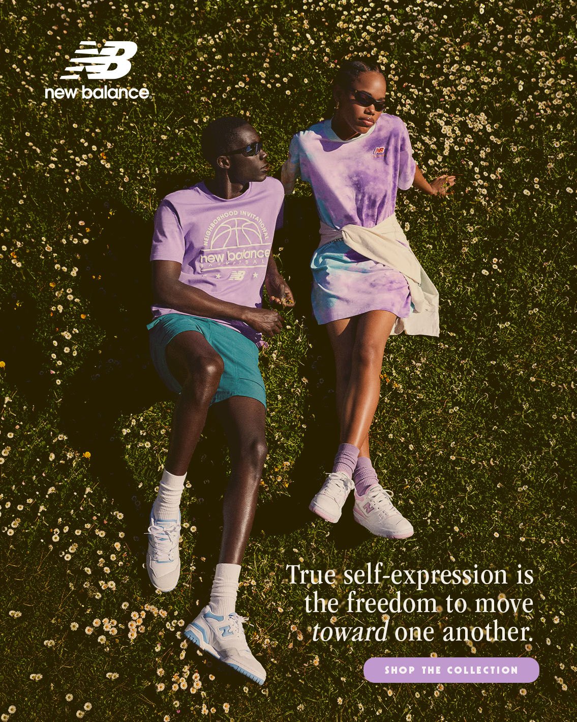
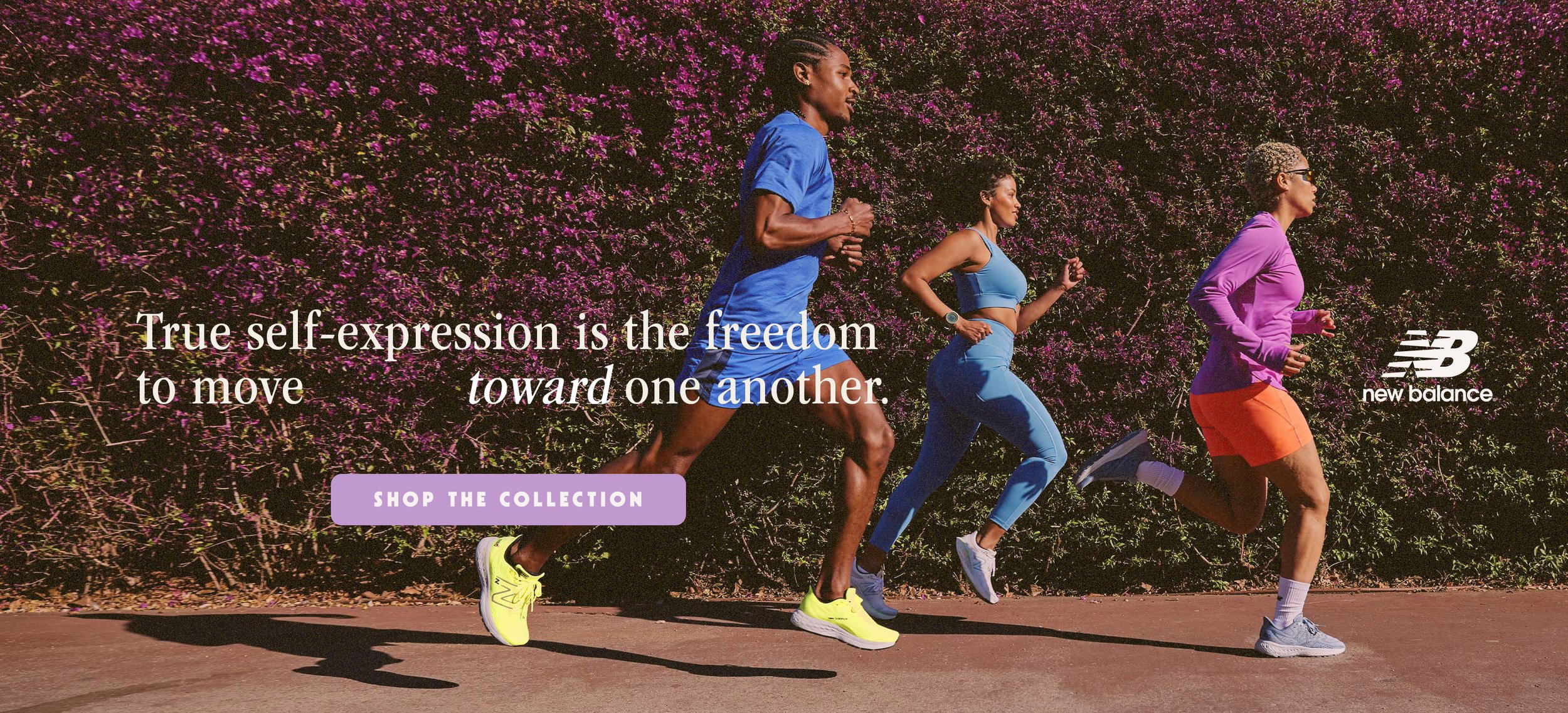
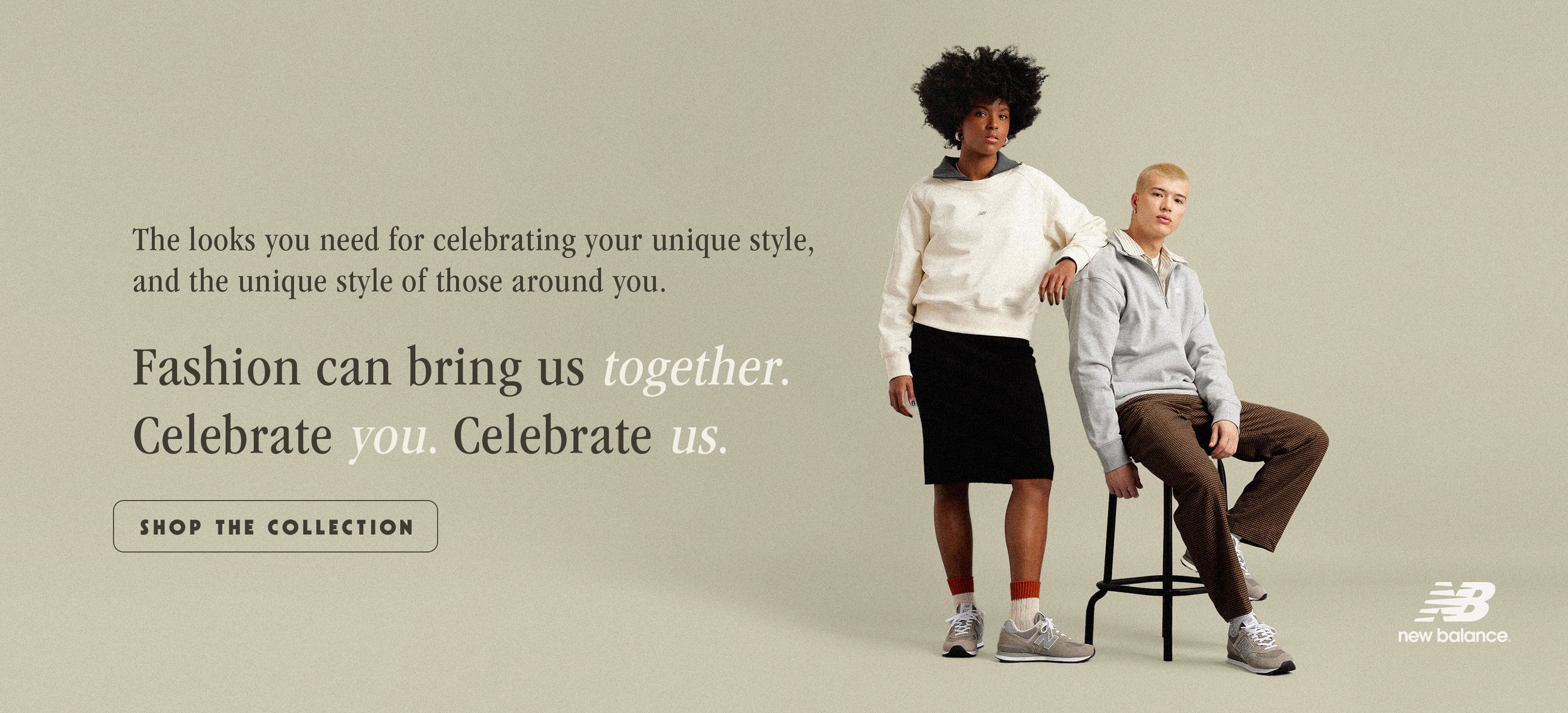
The image and font design was an effort to logically and directly reflect those feelings and illustrate the reality that we hope to invite the audience into, most directly shown by the images that show people being and moving together, as well as some directional arrangement of lines to suggest a feeling of movement. The larger bubble-letter font in some images is used to suggest an air of playfulness, energy, and creativity.
